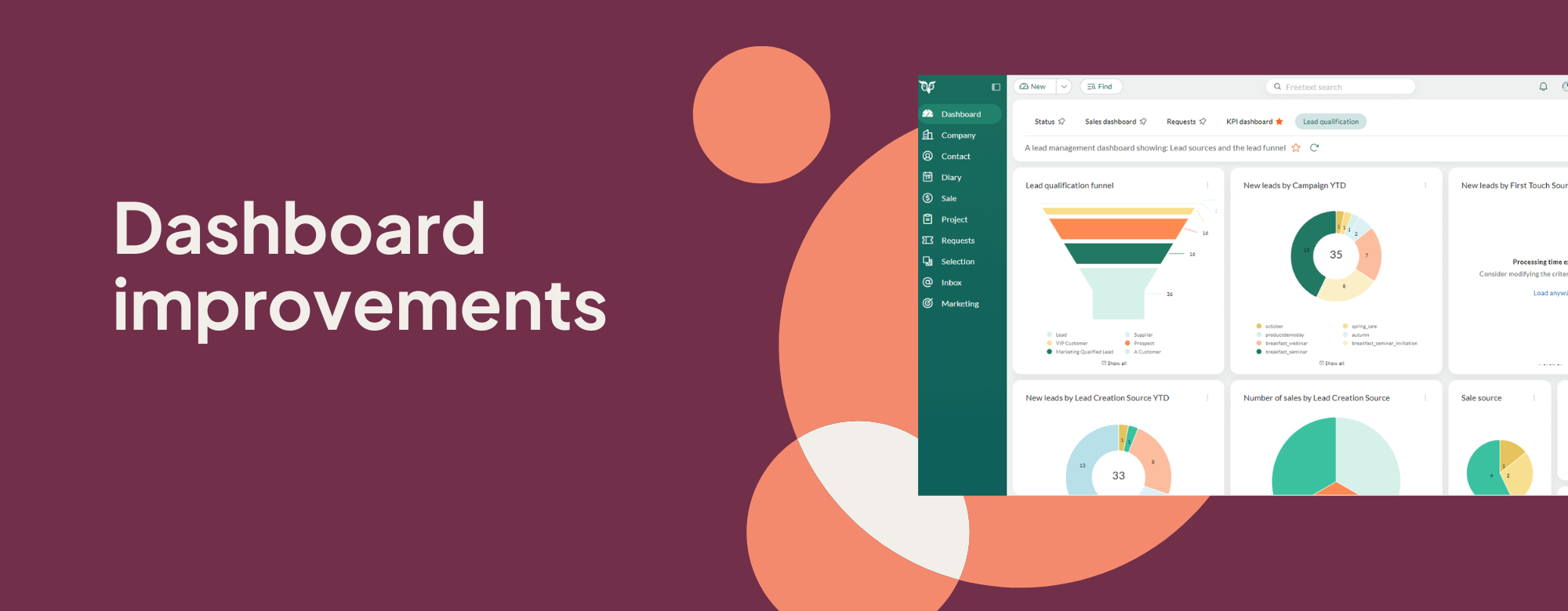
We are excited to introduce a set of improvements designed to make dashboards more intuitive and consistent to make daily decisions more efficient.
Quick filter
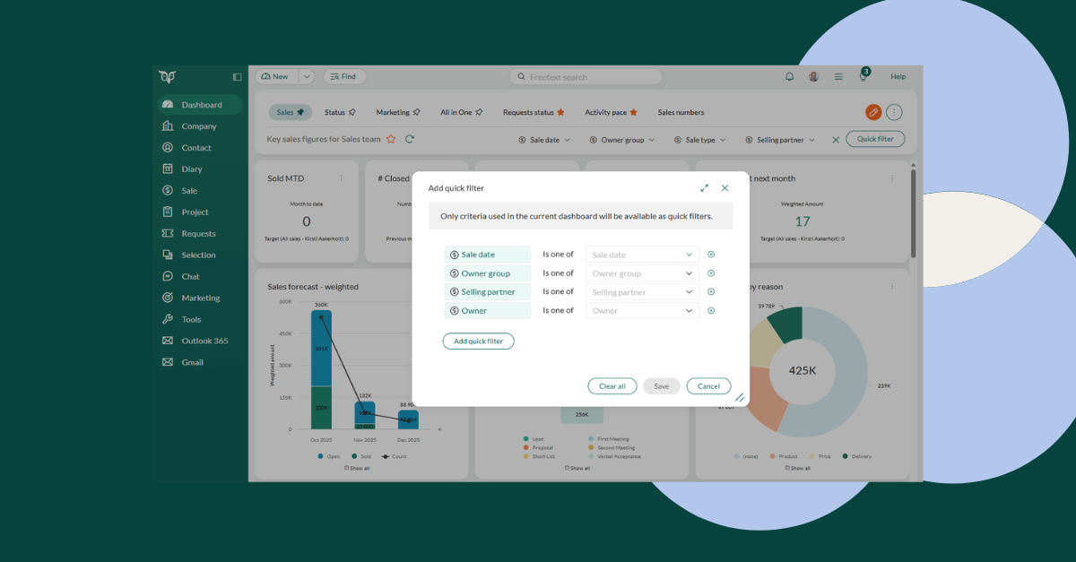
Flexible filtering options are now available across various data tiles. This is a great time saver, as you don’t have to create separate dashboards for data that you want to visualize. Simply adjust the views without navigating away from the current dashboard. The best thing: all list and date fields can be used as quick filters.
Smarter tile loading
Tiles that take too long to load now automatically time out, so one slow dataset doesn’t stall the entire dashboard. You can continue exploring insights while heavier tiles finish loading in the background, resulting in a smoother and more reliable experience. This is especially handy for dashboards with complex or external data sources.
Show or hide all legends
Managing tiles with multiple legends is now much easier. With a single click, you can show or hide all legends instead of toggling them one by one. Large comparison charts are now cleaner to read, and you can instantly zoom in on the trend or metric that matters most.
Better admin control
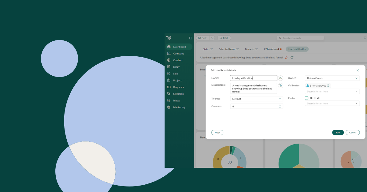
Dashboard administrators will now enjoy greater flexibility. They can change dashboard owners, access and edit any dashboard, and quickly see how dashboards are structured. Direct sharing links ensure that everyone views the same version, which makes collaboration even smoother.
Clearer tile details
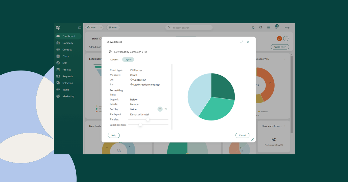
Opening a tile now reveals valuable configuration details, including the chart type and the dataset behind it. This makes it easier for power users and consultants to understand how insights are generated and to recreate visualizations on new dashboards without any guesswork.
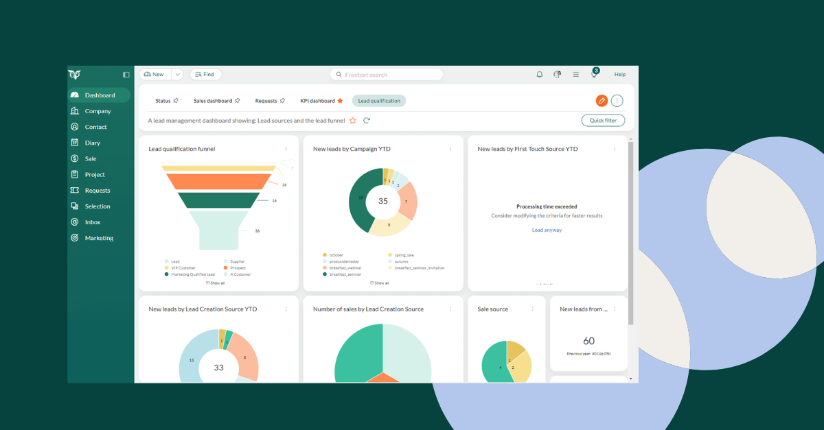
New funnel chart
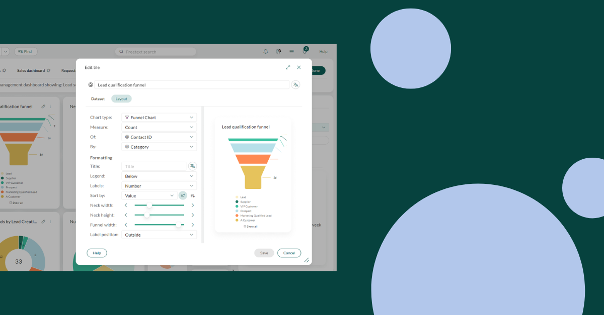
The brand-new funnel tile offers a more intuitive way to visualize progression. This will prove particularly useful for sales pipelines, conversion flows, and staged processes. You can quickly see where leads advance or drop off, which helps you pinpoint bottlenecks and prioritize follow-ups with greater accuracy.
See the stage when closed
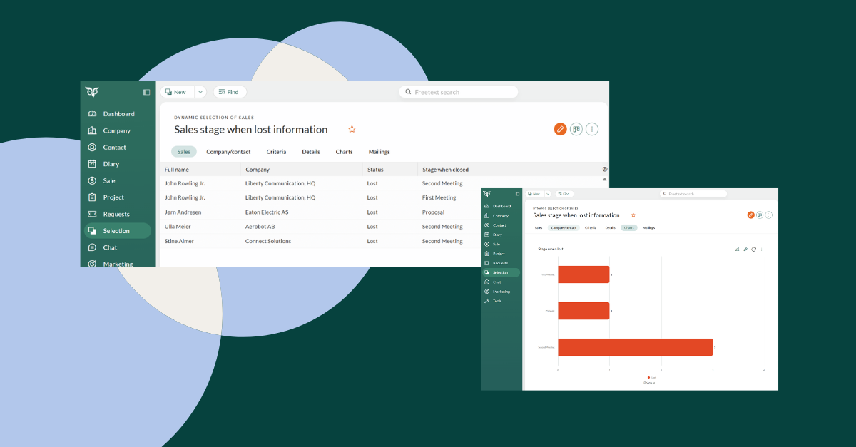
Dashboards now show which stage a sale was in when it was won or lost. This adds a context that has previously been missing from pipeline analysis. Identifying where deals tend to fall through makes it easier to recognize patterns and understanding which stages produce the strongest outcomes for you.
Try it out for yourself and let us know which dashboard improvements have made the greatest impact on your workflow!