New feature: dashboard - get easy insights into your CRM data
With your new, built-in dashboard you'll quickly get a glimpse into your own and your team's status. By visualizing your CRM data, you will easily see the results of your work. And best of all – the new dashboard feature is free and ready for use.
Visualize your data with dashboard tiles
Get better insight into your own and your team's sales and activities by filling your dashboard with graphs, lists, and key numbers.
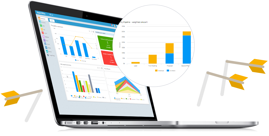
View your sales opportunities by phase
With the pipeline graph you'll see which phases your sales opportunities are in, along with the sum of them all, weighted by probability. When you know where your opportunities are, you'll easily determine which activities will help you close the most deals.
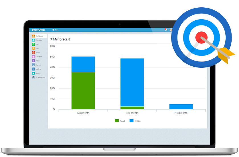
Predict how much you’ll sell for
If you know the total value of your completed and expected sales within a period, you also know how likely you are to reach your goals. This knowledge makes it easier to focus your efforts on critical activities.
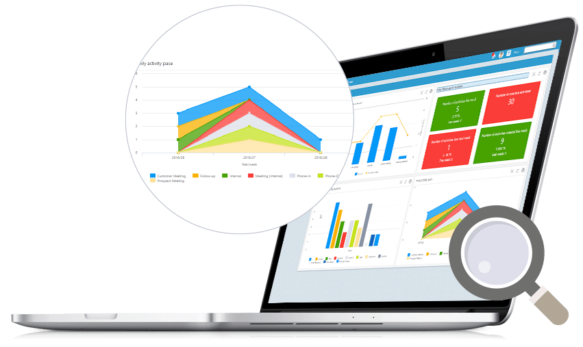
Check the pace of your activities to make better use of your time
With this chart, you will see how much time you have spent on different activities such as follow-ups and meetings week by week. You can compare this with your results to reveal whether your priorities led to the desired results.
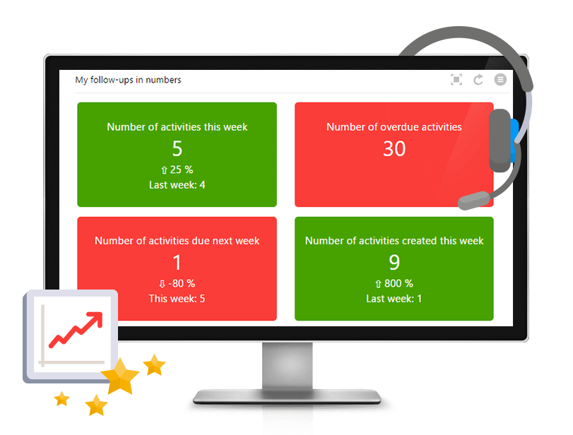
Key numbers for your sales activities
It’s time to face the truth. This figure will give you a status update of your sales activity in a relevant period. You’ll reveal whether you have planned, created, and completed enough sales activities, and you’ll know if you are keeping up the pace compared to last week.
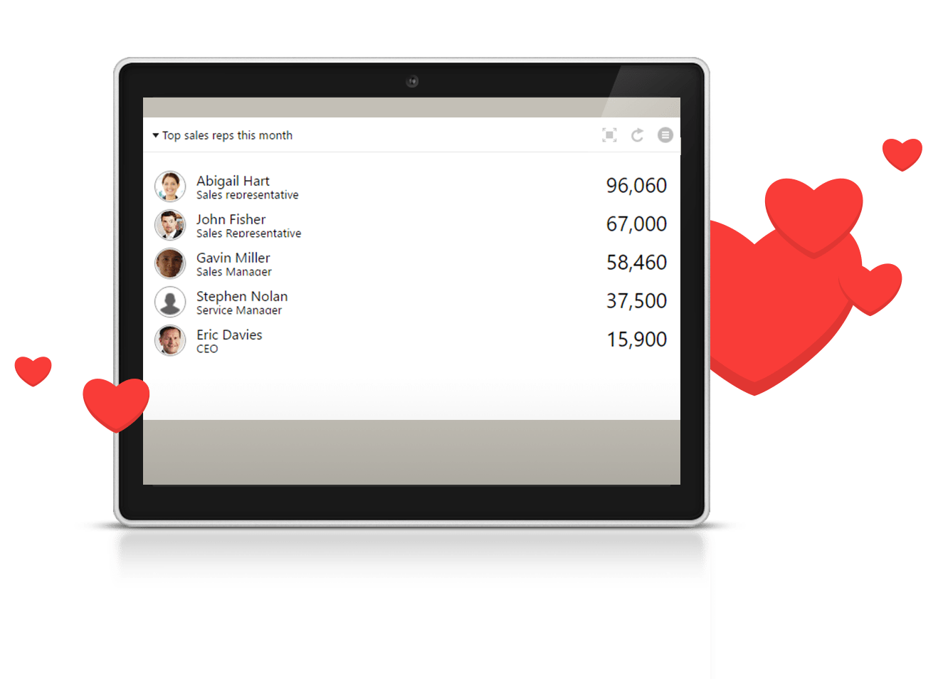
Top 5 sales people and their total sales
If you're aiming for the stars, use this list to keep track of your ranking. You’ll effortlessly monitor which team members sold the most this month, as well as their total sales amounts.
Set up your personal dashboard
You decide which figures to view on your dashboard and how to organize them.