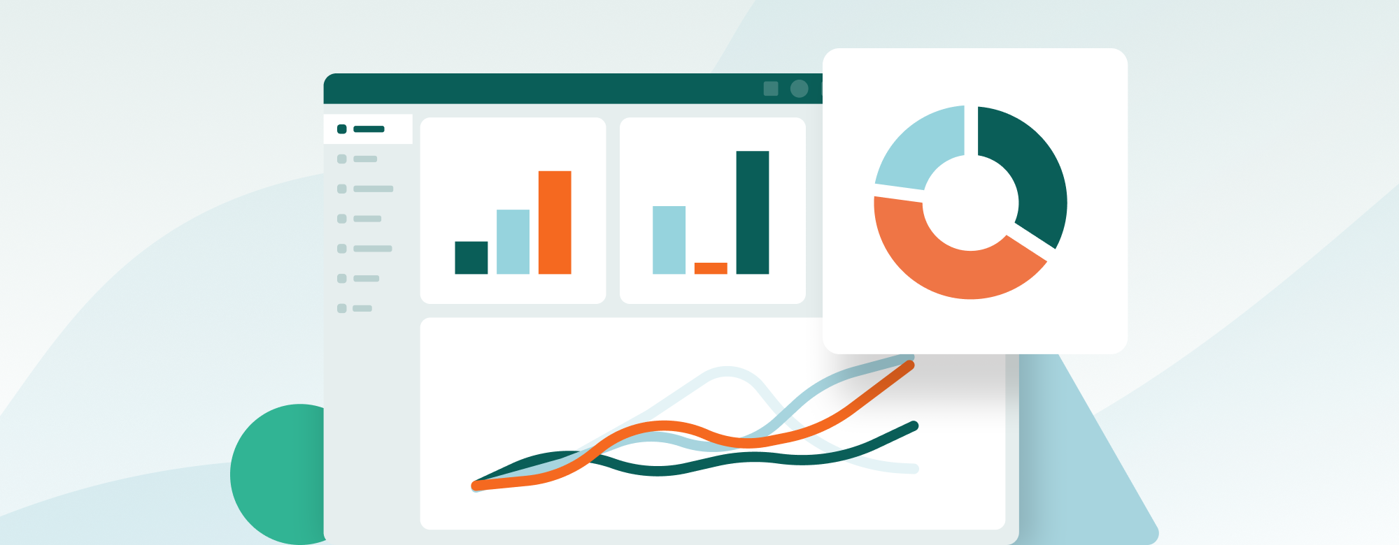
This summer we introduced the dashboard module to help you learn more about your CRM data. Now, we've improved your dashboard by introducing drilldown. Drilling down means accessing the CRM data behind the graphs and numbers – in any tile. Not only will you get easy insight into your data, you will also be able to create selections of the data for easy follow-up.
Highlights:
- Reveal the data behind any graph, list or number
- Create to-do lists by adding your records to selections
- Make your graphs more relevant by editing the data source
- Improve your data quality
Reveal the data behind any graph, list, or number
You can click on any graph, number, or list in your dashboard to see what information lies beneath it. Let’s use the graph “My forecast” as an example. The graph gives you an overview of the total amount of sales for last month, this month, and next month.
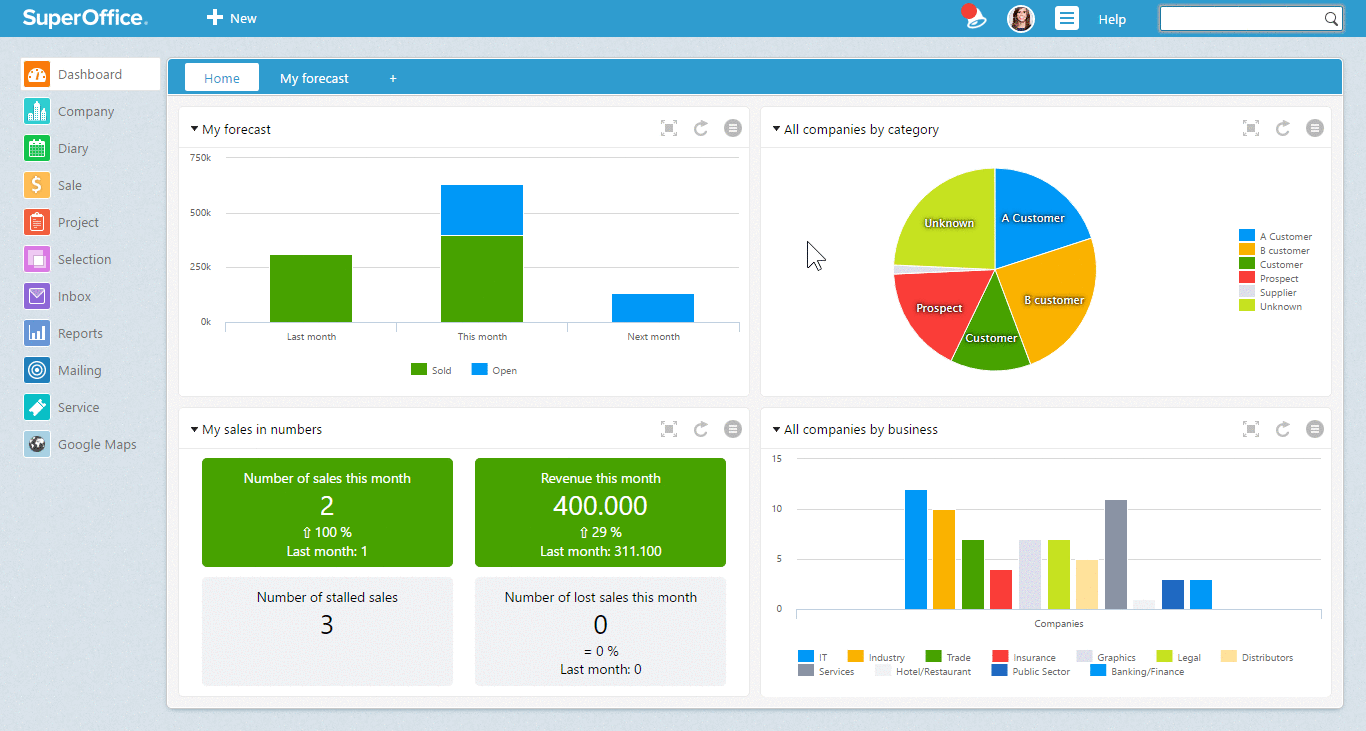
The “My forecast” graph will show you the total number of open and sold sales opportunities for last month, this month, and next month.
When you click on the column “This month”, the drilldown dialogue opens. This dialogue gives you an overview of all registered sales that are sold and ready for closing this month. You can click any column in your drilldown list to see preview information such as sales amount, sales date, and stage of the sale. You can even open each sale to have a closer look.
Configure your drilldown preview list
Every drilldown dialogue comes with a standard set of columns. You can add, remove, and prioritize columns any way you want.

Right click where it says Text to configure your columns
Create a to-do list: Add dashboard data to a selection
A simple way to follow up on your customers is to create a to-do list using selections. In SuperOffice Dashboard you can add sales, customers, or activities to a selection to create such an activity list.
To add records from a drilldown list to a selection, you can use the Task button in the drilldown dialogue window. You can either create a new selection or add your data to an existing selection.
By using selections, you will know exactly which sales, customers, and activities you have to follow up next.
A quick example: The dashboard tile “My companies by category” gives you the overview of all your company categories, such as customer, prospect, supplier, and so on. It is a pie chart that shows you which categories your contact database is built up of.

The graph “My companies by category” gives you an overview of how your database is built up by category.
As you can see, this database has a large group of contacts marked with the category Unknown. When you click on the green part that says Unknown, the drilldown dialogue will show you a list of all customers within this category.
 Click on Task and choose “Copy into selection” to create your to-do list.
Now that you know which companies are registered as Unknown, you can use the list to update the customers right away. Alternatively, you can add them to a selection. Then, use this selection to follow up on all companies in order to update their category.
By regularly checking up on your categories through the dashboard, you'll get great help in improving your data quality.
Make your graphs more relevant by editing the data source
Every standard graph in your dashboard uses a specific data source to draw up the graph and lists. The data source is the data series which the graph represents. You can edit the data source to make the graphs show data that is relevant to you.
Let's take the graph “My pipeline – actual amount” as an example.
As a sales manager, you need an overview of your sales team’s pipeline. To get that, you can change your graph to use the data source “My team” (or “All sales”).
However, as a sales rep, you may only want to see your own sales. In this case, you can change the data source to “Me”.
How to edit a data source in a dashboard graph

In the Edit dialogue, you can change the data source of your dashboard graph.
Improve your data quality
To get the right value out of your CRM system, you need to make sure the data in your system is up to date, correct, and doesn’t hold duplicate records.
The dashboard will help you to improve your data quality. When your dashboard says there is no data available, you should ask yourself why. It most likely means that you haven’t registered the sales and activities you are working on. There are plenty of situations where the user has to act to improve the data quality.
You should take action when the drilldown dialogue shows:
- a list of overdue sales opportunities (they will show up in red)
- a list with a lot of overdue activities (they will show up in red)
- you have no sales in your forecast for next month
- a list of sales to be closed this month, that are still in the first sales stage
You can use your favourite dashboards to show a status overview of your work in your weekly team or sales meeting. You can also use them during a 1-on-1 meeting with your manager.
Summary
With these new features, you will know what actions you have to take to raise the bar. You will see which sales, customers, or activities are behind your graph, and you can use static selections to follow up and update records.
To sum things up, here’s a list of what you can do:
- Reveal the data behind any graph, list or number
- Create to-do lists by adding your records to selections
- Make your graphs more relevant by editing the data source
- Improve your data quality